
Color Combinations That Make Dresses Look More Elegant
-
 StylerOutlet
 - StylerOutlet Blog
- Aug 18, 2026
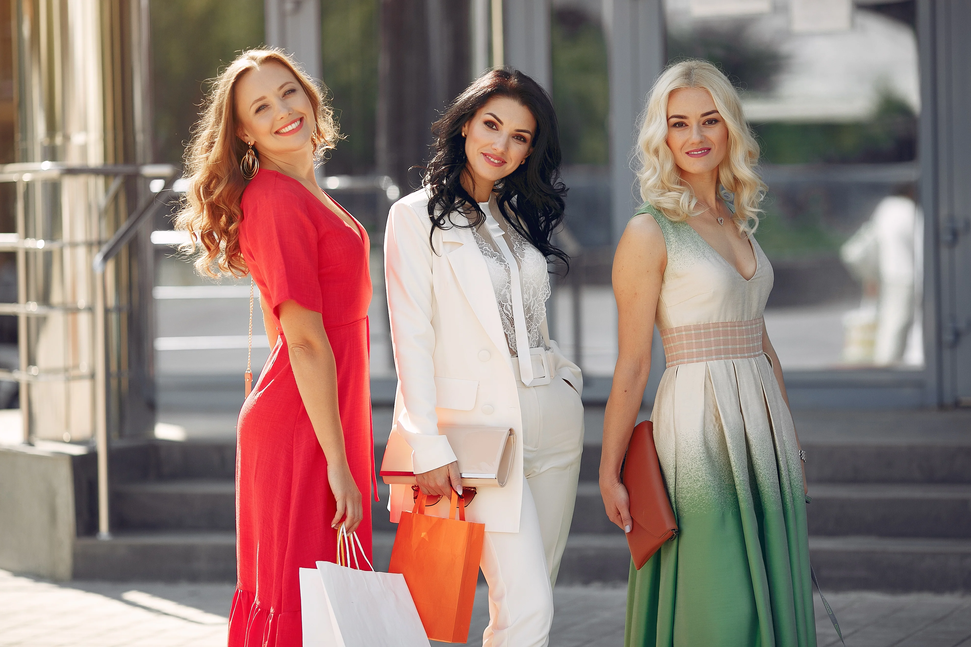
There's a moment every stylist knows well. A client tries on a dress, looks in the mirror, and says something like, "It's nice, but it's not quite... it." Nine times out of ten, the dress isn't the problem. The color pairing around it is.
Elegance in dressing has less to do with price tag and more to do with color logic. A hundred-dollar dress in the right tonal pairing can read more expensive than a designer piece worn with mismatched accents. Once you understand why certain combinations work - not just that they do, but why your eye reads them as sophisticated - you start making better choices without needing to think twice.
This guide breaks down the color pairings that consistently photograph well, read as luxurious, and hold up across seasons and occasions. No trend-chasing here, just combinations that have earned their place in a well-dressed wardrobe for good reason.
Why Color Matters in Fashion
Before a single detail of fit or fabric registers, color does the talking. It's the first thing the eye processes, often within a fraction of a second, and it shapes the entire first impression before anyone consciously evaluates the outfit at all.
There's real psychology behind this. Darker, saturated colors like black, burgundy, and forest green tend to read as authoritative and composed. Softer tones like blush, cream, and dove grey read as approachable and refined. Neither is "better" - they just communicate different things, and understanding that distinction is the difference between dressing on autopilot and dressing with intention.
I tell clients this often: color is the fastest way to change how a room perceives you, faster than fit, faster than trend, faster than brand. That's exactly why the right dress color ideas matter so much more than people initially assume.
Understanding Color Harmony
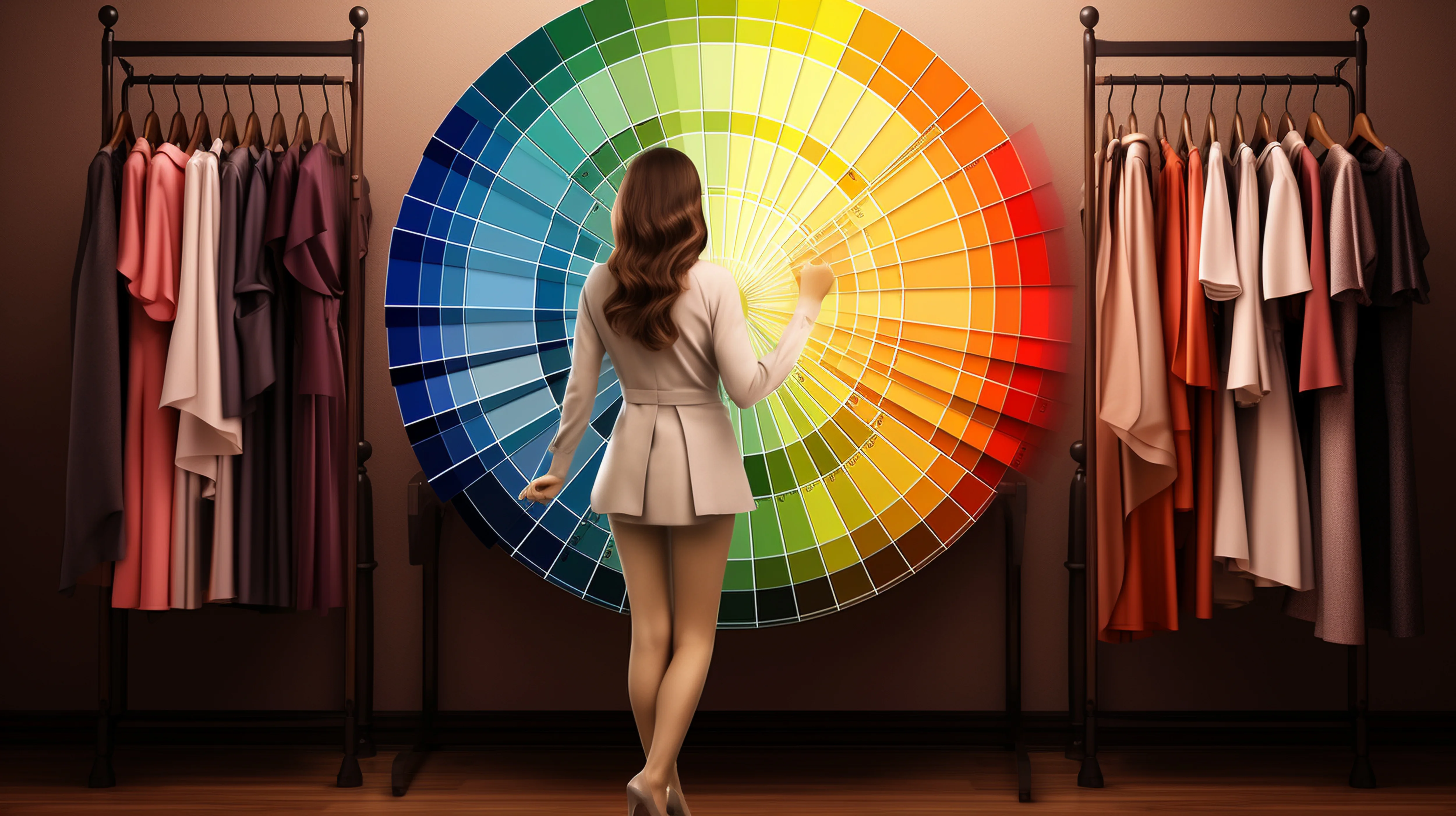
Color harmony isn't a rulebook - it's closer to a set of relationships the eye finds naturally pleasing. A few principles worth knowing:
Complementary colors sit opposite each other on the color wheel (like navy and rust) and create contrast that feels intentional rather than accidental.
Analogous colors sit close together (like olive and mustard) and create a softer, more blended look.
Neutral anchoring means pairing a bold or saturated color with something quiet - beige, cream, black - so the eye has somewhere to rest.
Most genuinely elegant fashion color matching comes down to that last principle. Even the boldest jewel-toned dress needs a neutral moment somewhere in the outfit, whether that's a bag, a shoe, or a layer. Without it, the whole look can feel like it's competing with itself.
Timeless Elegant Color Pairings
These are the combinations that never really go out of favor. Each one has a slightly different personality, so think of this less as a ranked list and more as a wardrobe of moods to choose from.
Black + Gold
This is the pairing people reach for when they want to look unmistakably polished. Black provides the quiet backdrop; gold - in jewelry, a belt, or a clutch - adds warmth and a touch of glamour without tipping into flashy. It works beautifully for evening events and reads instantly formal.
Navy + Beige
Softer than black, but no less sophisticated. Navy has a similar authority to black without the starkness, and beige keeps the whole look warm and approachable. This is my go-to recommendation for clients who want elegant but not severe - think client dinners, gallery openings, daytime weddings.
Emerald + Nude
Emerald is one of the most flattering jewel tones across nearly every skin tone, and pairing it with nude accessories lets the color do the work without visual clutter. This combination photographs exceptionally well, which is part of why it shows up so often on red carpets.
Burgundy + Cream
Rich and a little romantic. Burgundy carries warmth that most darker colors lack, and cream softens it further. This pairing works especially well in fall and winter, when deeper tones feel seasonally appropriate.
White + Camel
Understated luxury, essentially. This combination has a quiet confidence to it - it doesn't shout, but it reads expensive in a way that's hard to fake with louder color choices. Minimal accessories only; let the color contrast carry the outfit.
Blush Pink + Grey
An unexpected pairing that works because of the temperature contrast - blush is warm, grey is cool, and together they balance each other out. This combination feels modern and a little unexpected without losing any elegance.
Olive + Ivory
Earthy and grounded, olive plus ivory has become a favorite in more minimalist, quiet-luxury circles. It's a pairing that feels intentional rather than trend-driven, and it transitions well from day to evening with just an accessory swap.
Chocolate Brown + Champagne
Warm and luxe. Brown has had something of a renaissance in recent years, partly because it reads as rich and grounded rather than flat. Paired with champagne tones in jewelry or a bag, it creates a soft, glowing effect that photographs beautifully in golden-hour light.
Monochromatic Styling
Wearing a single color head-to-toe, in varying shades and textures, is one of the most reliably elegant tricks in fashion. A camel dress with a slightly darker camel coat and tan shoes doesn't read as boring - it reads as deliberate.
The key is texture variation. If everything is the exact same shade and fabric, the outfit can flatten out visually. Mix a matte dress with a slightly glossier bag, or a knit layer with a smooth-fabric dress, so the monochrome look has depth rather than looking like a single block of color.
Neutral Color Pairings
Neutrals get an unfair reputation for being "safe," but the best neutral pairings are anything but boring. Cream with taupe. Grey with black. Camel with white. These combinations rely entirely on subtle tonal contrast, which takes a more practiced eye to appreciate - but once you see it, you can't unsee how sophisticated it looks.
A practical tip: when pairing two neutrals, make sure one is slightly warmer and one slightly cooler. All-warm or all-cool neutral pairings can look flat under certain lighting; a bit of temperature contrast keeps the outfit visually alive.
Jewel Tone Combinations
Jewel tones - emerald, sapphire, ruby, amethyst - carry natural richness, which is exactly why they read as luxurious even in simple silhouettes. The trick with jewel tones is restraint elsewhere in the outfit. Let one jewel tone lead, and keep everything else - shoes, bag, jewelry - neutral or metallic.
Pairing two jewel tones together (sapphire and emerald, for instance) can work beautifully, but it takes a confident hand. If you're experimenting with this for the first time, anchor it with one neutral piece, like a black bag, so the combination doesn't feel like too much at once.
Seasonal Color Combinations
Spring: Blush pink + grey, olive + ivory - soft, fresh pairings that feel light without losing polish Summer: White + camel, emerald + nude - combinations that hold up in bright, natural light Fall: Burgundy + cream, chocolate brown + champagne - warmer, deeper tones that suit the season's mood Winter: Black + gold, navy + beige - combinations with enough richness to feel appropriate for colder, darker months
This isn't a strict rulebook - plenty of these pairings work year-round. But leaning into seasonal color combinations does help an outfit feel timed correctly, which is part of what separates an elegant look from one that just misses the mark slightly.
Colors That Photograph Beautifully
Some colors are simply more forgiving to a camera lens than others, which matters more than ever with how much of daily life gets documented. Emerald, burgundy, and camel tend to photograph rich and true to life. Stark white can occasionally blow out in bright light, so a soft ivory is often a better photographic choice than pure white.
Matte finishes generally photograph better than high-shine fabrics, which can create unflattering glare. If you know you'll be photographed - an event, a wedding, a work headshot - this is worth factoring into your color choice from the start.
Colors That Look Expensive
There's a reason certain colors get associated with "luxury fashion colors" specifically. Deep, saturated tones - chocolate brown, forest green, deep burgundy - tend to read as more expensive than bright, high-saturation colors like neon or pure primary shades. Muted, complex colors (think olive rather than lime, camel rather than orange) also tend to look more refined.
Fabric plays a role too, but color does a surprising amount of the work on its own. A muted, well-chosen color in an affordable fabric will often read as more expensive than a bright, trend-driven color in a costlier one.
Accessories That Complement Each Combination
Accessories are where a color combination gets finished, not started. A few pairing principles:
- With black + gold, keep accessories in gold-toned metal and skip silver entirely to avoid a mismatched metallic mix
- With navy + beige, a woven or leather bag in cognac ties the whole look together
- With emerald + nude, gold jewelry adds warmth without competing with the dress color
- With blush + grey, silver jewelry complements the cooler grey tone better than gold does
The general rule: accessories should reinforce the color story, not introduce a new one. One unplanned bright accessory can undo an otherwise carefully considered combination.
Shoe and Bag Color Matching
This is a place where a lot of otherwise great outfits lose points. Matching shoes and bags exactly can look elegant, but it can also look a little dated if not done with care. A more modern approach: choose one accessory in a complementary neutral (nude, black, camel) and let the other pick up an accent tone from the dress.
For example, with a burgundy + cream dress combination, a cream bag and burgundy-toned heels create cohesion without looking overly matched. This kind of intentional near-matching reads more sophisticated than an exact match every time.
Makeup Pairing Tips
Makeup should support the dress's color story, not fight it. With warmer combinations like chocolate brown + champagne, warm-toned bronzer and a soft berry lip work beautifully. With cooler pairings like blush + grey, a rosy blush and mauve lip tone keep everything harmonious.
A simple guideline: if your dress combination leans warm, keep your makeup warm too. If it leans cool, do the same. Mixing warm makeup with a cool-toned outfit - or vice versa - is a subtle mismatch, but it's one the eye notices even if it can't always say why.
Color Mistakes That Reduce Elegance
A few patterns show up again and again, and they're worth naming directly:
- Wearing too many competing bold colors at once. One statement color per outfit is usually the limit.
- Mismatched metal tones. Gold jewelry with silver shoes is a small detail, but it registers.
- Ignoring undertones. A warm-toned dress next to a cool-toned accessory can look slightly "off" even if both colors are individually lovely.
- Overlooking lighting. A color that looks elegant in daylight can shift dramatically under warm indoor lighting - worth checking before a big event.
- Skipping the neutral anchor. Even the boldest combination needs one quiet element to keep it from feeling chaotic.
Choosing Colors Based on Skin Tone
This is genuinely one of the most useful things a good stylist can teach a client, and it's simpler than most people expect.
Cool undertones (skin with pink or blue undertones) tend to look especially striking in jewel tones, true black, and icy pastels.
Warm undertones (skin with golden or peachy undertones) tend to glow in camel, chocolate brown, olive, and warm burgundy.
Neutral undertones have the most flexibility and can generally wear both warm and cool combinations well.
A quick way to check: hold a warm-toned fabric and a cool-toned fabric near your face in natural light. Whichever makes your skin look brighter and more even, rather than slightly grey or washed out, points you toward your undertone family.
Choosing Colors for Different Occasions
- Work events: Navy + beige, olive + ivory - polished without being flashy
- Date night: Emerald + nude, burgundy + cream - rich, romantic, still refined
- Weddings (as a guest): Blush + grey, chocolate brown + champagne - festive but respectful of the occasion
- Formal evening events: Black + gold - timeless and dependable
- Daytime casual: White + camel, olive + ivory - relaxed but never sloppy
Matching the color combination to the formality of the occasion is just as important as the pairing itself. A gorgeous jewel-tone combination can feel out of place at a casual daytime event, just as a very muted neutral pairing can feel underdressed for an evening affair.
Fashion Expert Recommendations
If there's one habit I'd recommend adopting above all others, it's this: before getting dressed, decide on your color story first, then build the outfit around it - not the reverse. Most styling mistakes happen when people choose pieces individually and hope they'll cohere at the end.
Second recommendation: keep a small "capsule" of go-to color combinations you know work for your skin tone and lifestyle, rather than reinventing your color choices every time you get dressed. Most well-dressed people aren't choosing new combinations constantly - they've found four or five that consistently work and lean on them.
And finally, don't underestimate the power of a single well-chosen metallic accessory to elevate an entire combination. It's often the fastest, lowest-effort way to make any color pairing look noticeably more elegant.
Frequently Asked Questions
What color combination looks the most elegant on a dress?
Black and gold is one of the most consistently elegant combinations, since it reads formal and polished with almost no styling effort. Navy and beige is a close second for a softer, more approachable elegance.
How do I choose dress colors that suit my skin tone?
Identify your undertone first - warm, cool, or neutral - then lean toward camel and olive for warm undertones, jewel tones and true black for cool undertones, and experiment freely if your undertone is neutral.
Are neutral color combinations less elegant than bold ones?
Not at all. Thoughtfully paired neutrals, like cream and taupe, often read as more sophisticated than bold combinations because the subtlety signals confidence rather than effort.
What colors photograph best for events?
Emerald, burgundy, and camel tend to photograph rich and accurate under most lighting. Very stark white can occasionally overexpose in photos, so a soft ivory is usually a safer choice.
Can I mix two jewel tones in one outfit?
Yes, but anchor the combination with a neutral accessory, like a black or nude bag, so the two bold colors don't compete for attention.
Do gold or silver accessories work better with most dress colors?
Warmer dress colors (camel, olive, burgundy) generally pair better with gold, while cooler colors (grey, navy, true black) tend to suit silver. When in doubt, gold is the safer universal choice for warmer tones.
What's the biggest color mistake people make when trying to look elegant?
Wearing too many competing bold colors at once. One dominant color with a neutral supporting cast almost always reads more elegant than several bold tones fighting for attention.
Is monochromatic dressing more elegant than color-blocking?
Both can be elegant when done well. Monochromatic dressing tends to be more forgiving and universally flattering, while color-blocking requires more careful color theory to pull off successfully.
How can I make an inexpensive dress look more expensive through color?
Choose a muted, deeper tone rather than a bright, high-saturation color, and pair it with one quality metallic accessory. Color and one well-chosen accent do more for perceived value than most people expect.
Do color combinations change with the season, or do some work year-round?
Some, like black and gold or navy and beige, work reliably year-round. Others, like blush and grey or chocolate brown and champagne, feel more suited to specific seasons but aren't off-limits outside them.
Conclusion
Elegance, in the end, isn't about following a strict formula - it's about understanding why certain color relationships feel balanced to the eye and using that knowledge with intention. Once you know that navy softens where black sharpens, or that a single metallic accessory can elevate an entire combination, you stop guessing and start dressing with genuine confidence.
The next time you're staring at your closet trying to decide what to wear, start with color first. Pick a combination from this guide, build the rest of the outfit around it, and trust that the pairing is doing more work than any single piece could do alone. That's really the whole secret behind dresses that look effortlessly elegant - it was never about having more clothes. It was about understanding the colors you already own.



 RSS Feed